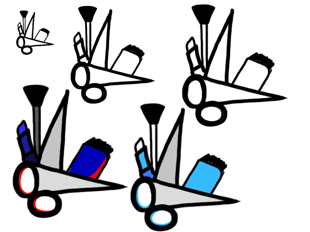
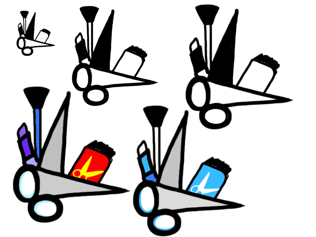
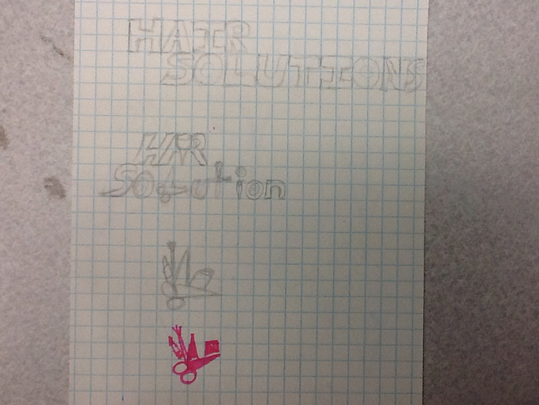
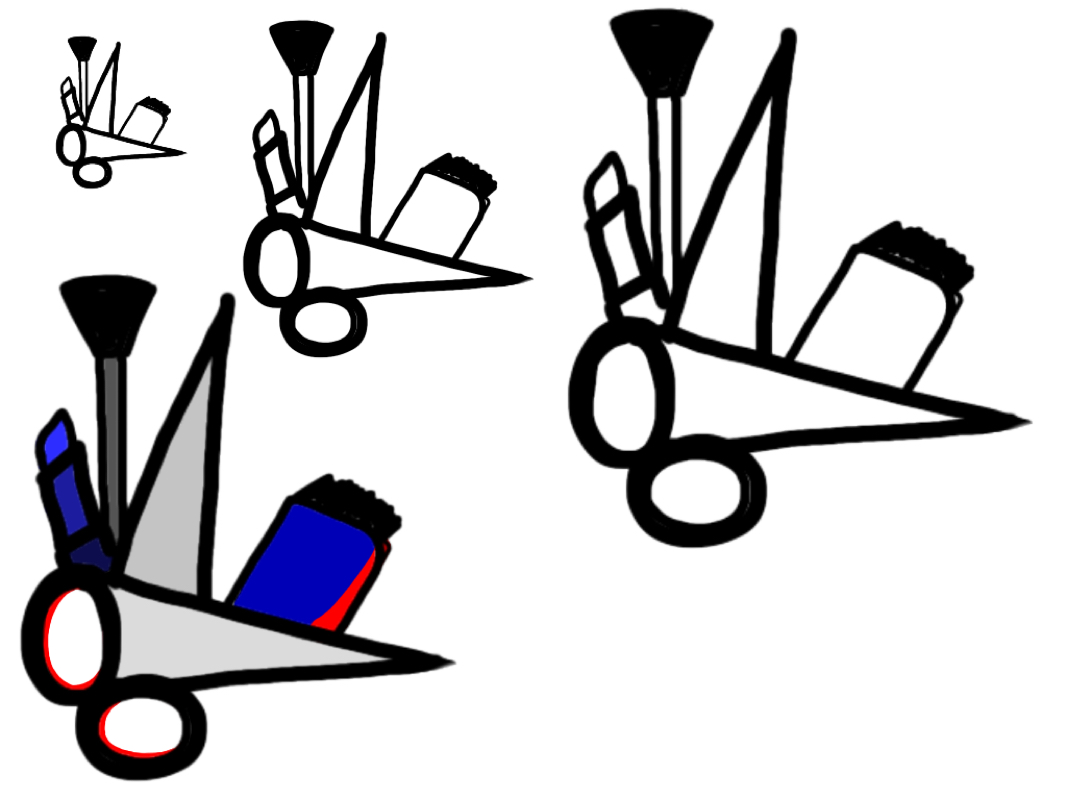
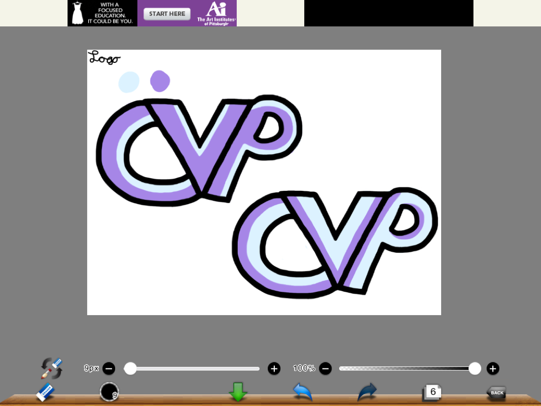
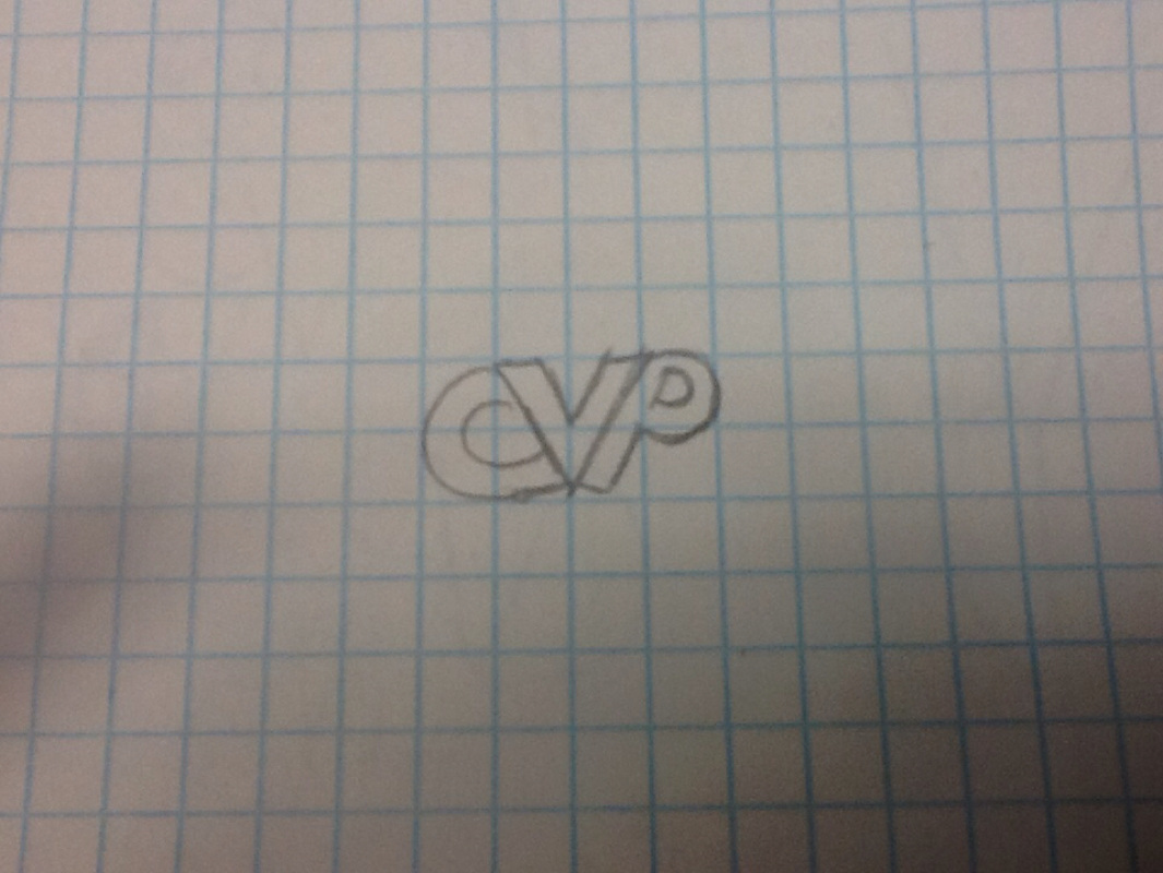
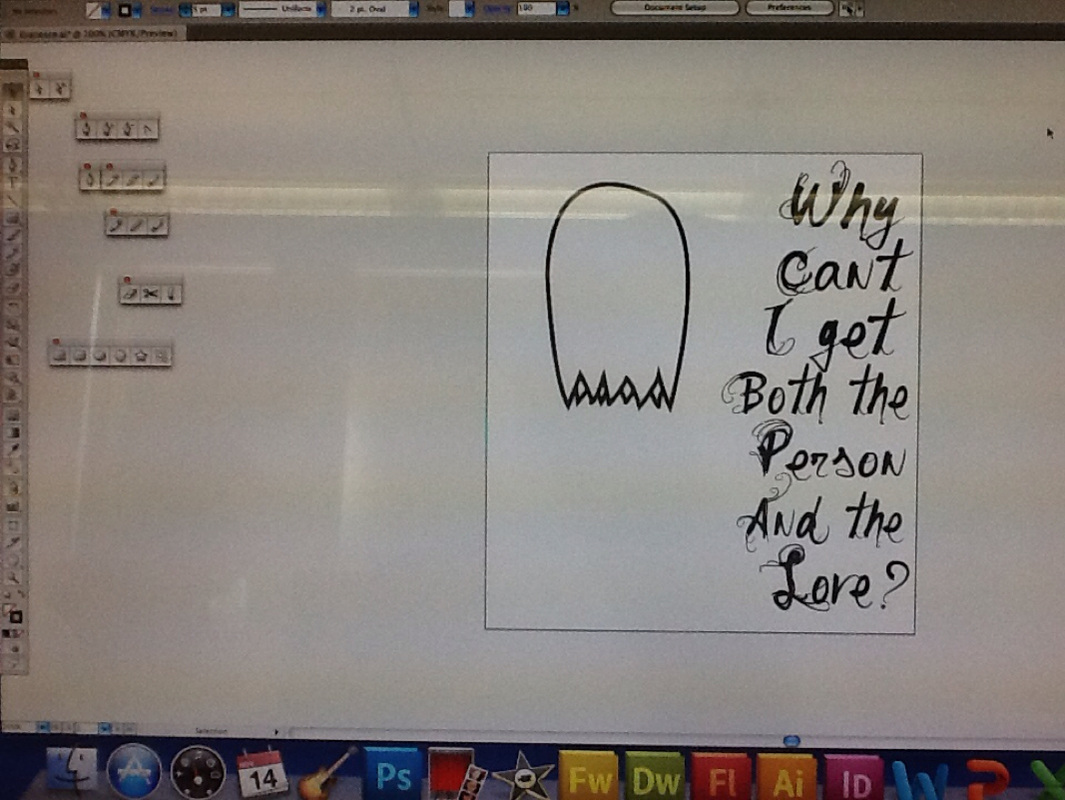
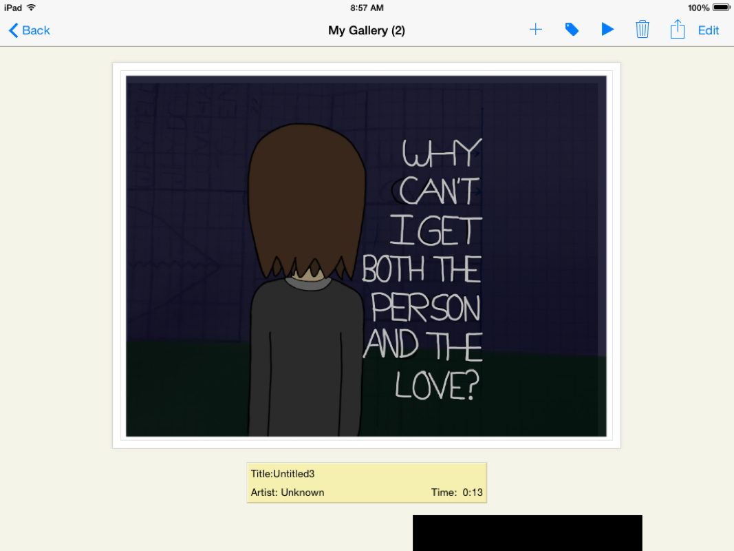
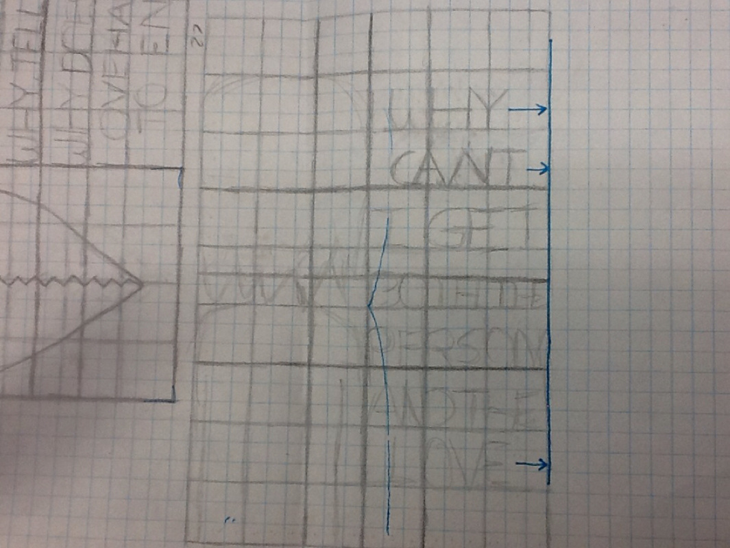
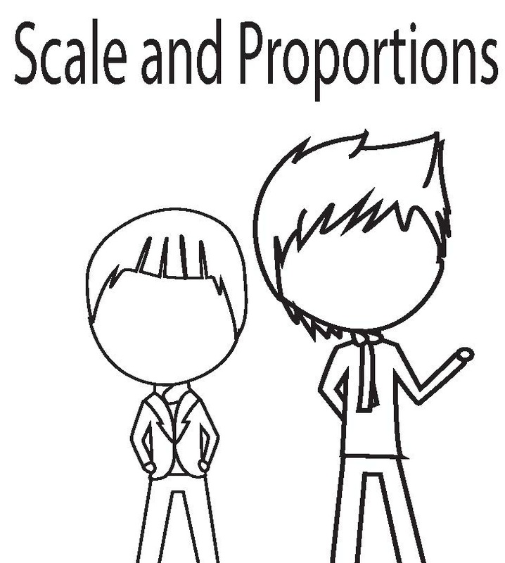
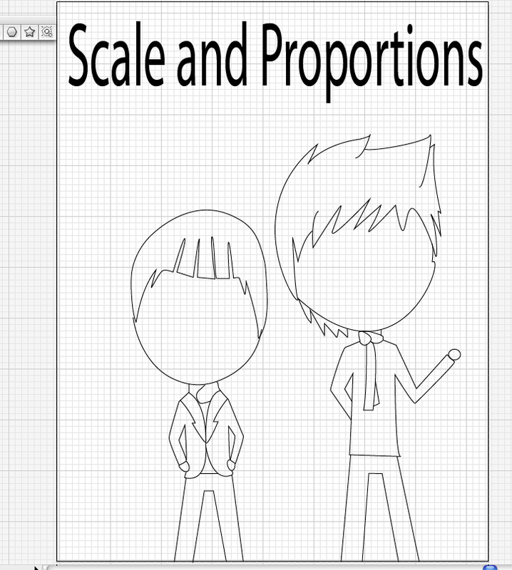
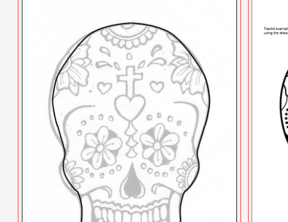
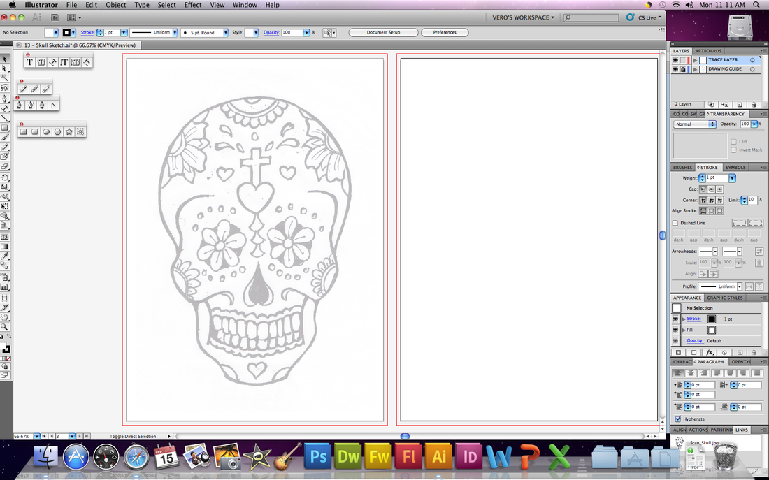
I have started the background of my project. It's not much yet but it's getting there. I still need to trace the logo and add the text over it. What I plan to do is have a eye catching background with the logos in different places. The text with in will go over the logos because they're not very important. Out of everything the logos and the text are my main priority since the project relives around it. I hope to have this done soon, until the next post.
My logo is starting to look better. I've finally transfered to my sketch to Adobe. I've traced the drawing with the pen tool and made the logo better looking. The lines are straight and the circles are round because my drawing wasn't that refined. I've started adding color to and its a bit frustrating because I need to fill a lot of shapes in. I should be done by the next post. I have my layout figured out for what it's going to look like. Normally I would do something big and complicated but I decided to tone it down. The logos are of three major groups of SM Entertainment. The informations isn't all going to be about SM, it's going to include JYP, and YG. I'm getting the information in place which is on top of the logos. Hopefully I have more done in my next post. My topic for my info graphic is Kpop, big surprise. My main subjects will be what's the percentage of albums sold in other countries? Where it has attacked (hit)? How popular it is around the world? I'm looking up facts and statistics for my topics and I hope to have everything in order by the next post. I've polished my design a bit and tweaked the color a biit from the original scheme. In my opinion it's almost ready to be sent to my client after I double check if it's alright in the way it is already. I knew I should've sent it soon but I wanted to make sure it was good enough before my client added some suggestions. Once I get my feedback from my client, I will begin my final logo designs. Goodbye for now. This is my final product. What I was aiming for and achieved was a sad, emotional picture. The loneliness of the person standing alone and the lyrics really ties the picture together. It took me a while to get everything to go together and I'll admit there could be improvements to make but I'm pretty satisfied with it.
I didn't receive a reply from my client for my logo for them. I'm going to move forward with my project. I have used some of the colors requested by my client. I used the blue color and added four more colors. To be honest I should've toned the amount of colors I had. It doesn't seem as unified as the one requested by my client. I haven't even thought about it the amount of colors I got until Martin reviewed my work. Thank you Martin for helping reviewing my work. Bye. For my company, I was given a hair salon. I was to make a logo for the salon so with little thought I went to google. It was to appeal to kids, women, and men so that's going to be a struggle. My logo had to appeal to different catagories and with that in mind I looked at the logos in those catagories. I got a simple idea for it and I've started on it. Until next blog. I finally have a couple of sketch for the logo. After trying for a while to get all of the catagories to connect, I have a design. Normally I would go for something big and complicated but this time I went simple, really simple. I was given a simple color scheme and I followed it a little but I did some modifications to the colors making my own version of it. I also resized it to make sure the design was flexible to being shrunk down and blown up. That's all for this update, until the next one. It took me a while to get the background to the way i wanted it. i should've done the background first so i didn't have things issue as i was working on the figure. I wasn't thinking about my background but it's decent since I'm getting better with the tools on Adobe.
For the beginning part of this project we were suppose to to make a logo out of our names. I had a couple of good sketch ideas and I picked the one I wanted to do the most. I picked colors that described me the most which were purple and blue. My logo has my intials VCP, but it looks like CVP. V is for my first name, C is for my first last name and P for my second last name. That's all I have with my logo. Till next time. I have finally started on my project and it's looking great so far. I have the text down and in working on the drawing. I haven't put it in the rules of three yet but I will once I get the drawing done. The font will be changed to a white color like of the sketch and will have a dark background. The font doesn't look the same in the final sketch because that was a draft. This is all have have to update for now. My next post will be about my project being completed, bye. I have gotten my sketches done and picked one to do for my final product. I've played around with some colors but dark colors would do well for this piece since the lyrics don't really fit a happy setting. The lyrics I have chosen say "Why can't I get both the person and the love?" I have the layout set for when I start with this on the computer. I have where I'm going to place my words and my background is sad enough. I should add some rain drops while I'm at it. That's all I have for this blog post, and i wish to have more when I start my final project. Annyeong!
For this project, I'm doing lyrics from my favorite song by Super Junior, Evanesce. What I've been doing lately was looking for fonts that describe the feelings of the songs, which would be sad and emotional. I don't know how to explain fonts well. I've also been looking up pictures to go with the feeling of the song. What I personally think what pictures would go with the lyrics is maybe some rain drops, or broken heart or just a plain black background. I haven't made my final decision on my design but I'm getting there. Until next blog.
Part of being an artist is criticizing one's art. I critiqued my own art I felt I could've done better. In the end I decided to cut out two members becuase I wasn't going to have enough time to put them in place because the last one in the formation wasn't outlined in time and I wanted it to be an even number. That's why I made my decision to cut those two out and left the other two. It saddens me that I had to do that it because I wanted to finish on time. I met my goal on this because it's somewhat what I imagined it to be. I didn't want to add color and I think it was lacking in some proportion. Overall it's a success because I did show proportion and scale. If I were to start from the beginning again I would change the plan to save time and show more proportion and scale. It was my first success project on Adobe Illustrator, so that's the end of my blogging for this project.
With the feedback Sam gave me, I was able to improve my picture a bit better. What I learned from it was I need my picture to look more like the topic I was given. I still wasn't done and I haven't arranged them in to the position I wanted them to be. There was a bit of the main idea in there and it also gave off a cute feeling about it, which was something I was aiming for. I'm not going to add color to it because that would take up my time and the color wouldn't fit in together. It's coming together well and I hope it stays like that. Till the next blog.
i don't have much pictures of my sketch during the project. So far I have drawn the outline for two of the figures and half of one. It's coming together well in my opinion. The pen tool is very handy but it's hard to curve them when I don't use the direct selectiontool. I figured out how to do that without needing to use the direct selection tool. I should've knew how to of that from the start but I was a little dense to actually figure it out. The main figure is almost done because except for the bottom half. I forgot to draw the hat on the shortest figure so when I get done with the main, I'll work on the youngest's hat. That's all I can say for what I've done, it's kind of hard to explain everything without showing what I did in the process. Hopefully it would be better in the next blog.
I'e gotten a bit father in my project and I regret my decision of doing something this complicated. Instead of using live trace I decided to hand draw it. I thought it would be better because that way it wouldn't have a lot of straight lines and stiff curves. On adobe illistator
For my project I got scale and proportion. The sketch I did showed one figure in the front and the rest standing behind the first figure. I forgot to add scale and proportion title but I can fit that in there without it looking bad. The second picture is of another sketch I was planning on doing. The sketch may not be visible because I'm writing the blog on my iPad. The drawing is of four members of my favorite group, SHINee. I excluded one of the members because he wouldn't fit in the drawing, oh well. The one I'm going with is the one where there's one main and everyone else is behind him. It seems like a good idea and I like the way it positioned. I'll have more on the project when I get more progress done, till next time.I've finished tutorials 13-19 and I'm working towards my first project on adobe illustrator. I learned to use image trace which is tracing an image and create an outline. Trace drawing taught me to draw over the outlined layer. That information will come in handy when i get started on my project. The coloring skill will also be helping for coloring the image and make it look decent. That's all I have for my tutorial blog since it's my last one. My next blog will be about the beginning of my project, luck will need to be by my side, bye.
Annyeonghaseyo, this is my progress I have so far. I have finished tutorials 1- 12 and continuing with 13-19. I'm sure playing with the pen and pencil tool was easy because I can create the line and shapes. Even though I didn't do a very good job at it, i still learned a lot about that tool. I learned how to make curves but using the direct tool. It was a bit difficult due to the fact it changed the shape of one side and didn't do what I wanted it too. I haven't run into any major problems yet sure I've had some moments where I get stuck but I solved easily. It's usually the layer is locked or I wasn't using the right tool, nothing major. That's all I have to share for now, until i finish the other tutorials.
|
AuthorWrite something about yourself. No need to be fancy, just an overview. Archives
December 2014
Categories |